

1st Place Winning Entry | 2025 Pastel Competition
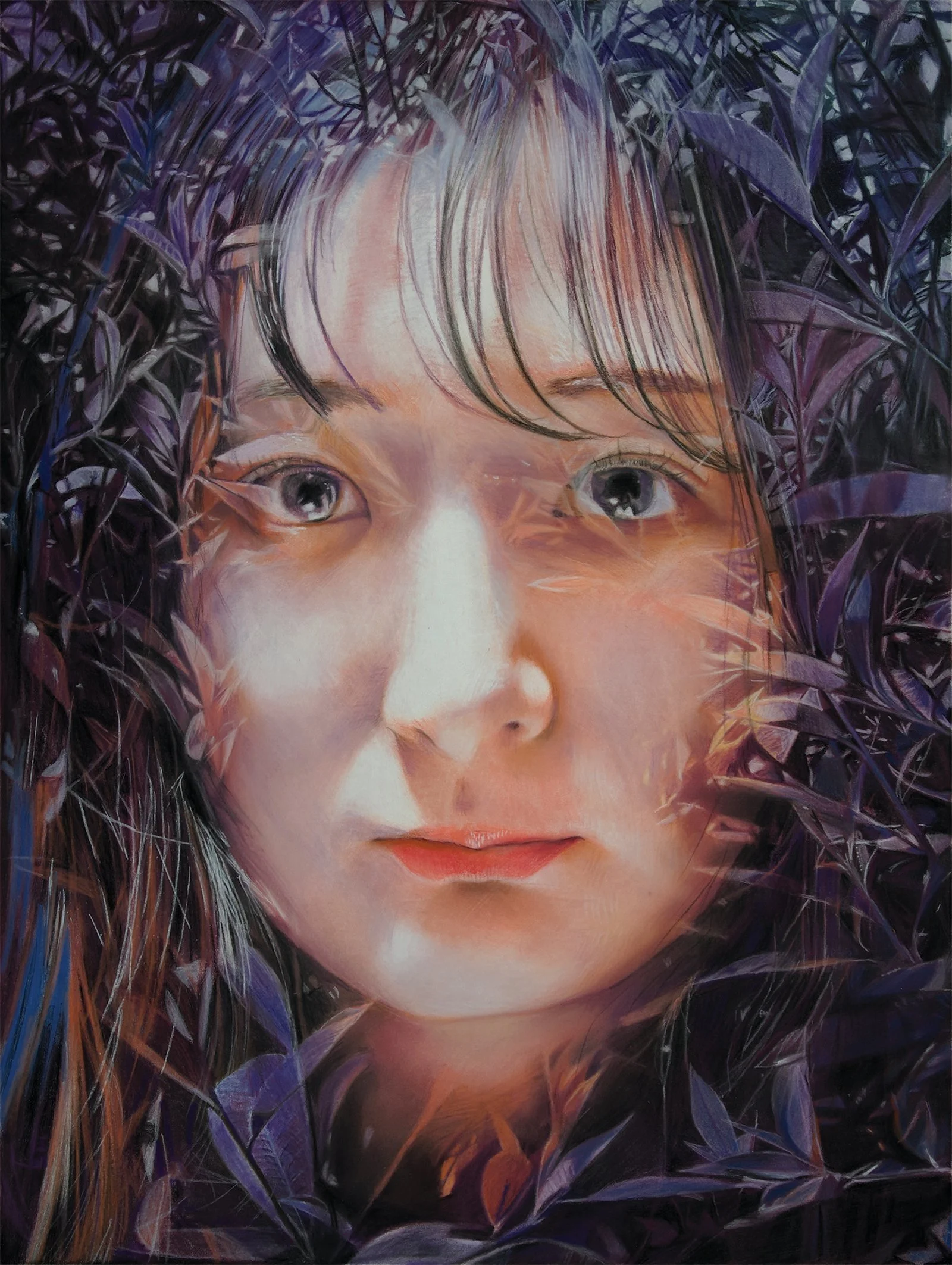
Takashi Ogihara, “Red Robin’s Silence,” pastel
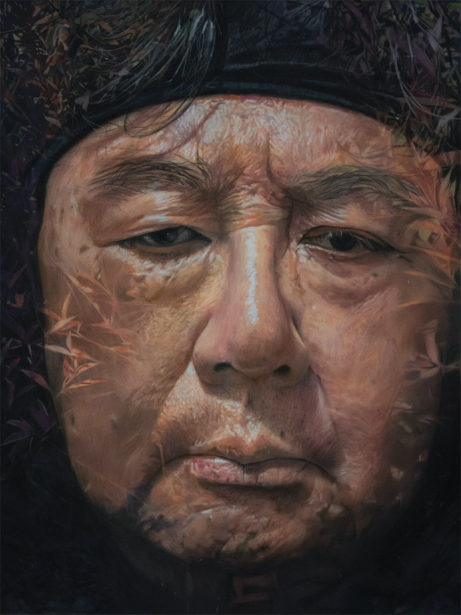
Takashi Ogihara Red Robin's Mercy, pastel

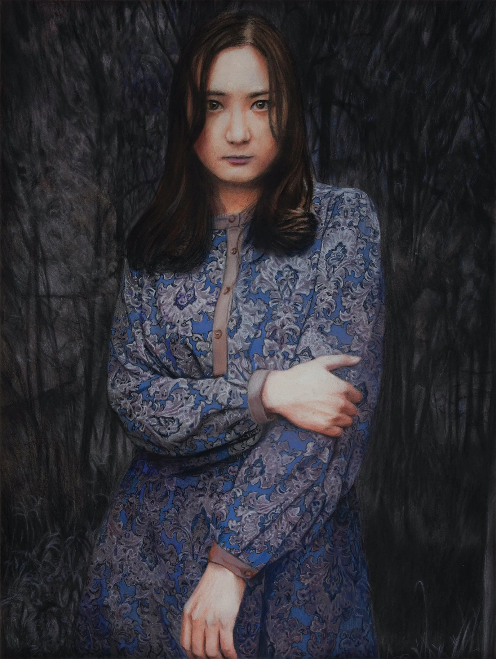
Takashi Ogihara His Kitchen, His Forest, pastel
Takashi Ogihara I've Finished Dialogue with My Past, pastel

Takashi Ogihara A Tiny Slice of Earth, pastel

Takashi Ogihara Ruby, pastel
TAKASHI OGIHARA | 1ST PLACE
2025 PASTEL COMPETITION
Born in Nagano, Japan, Takashi Ogihara is currently based in Saitama. He studied visual communication design and illustration at Tokyo University of the Arts and began his career at an advertising agency before going independent as a package designer, creating packaging for more than 500 products.
He also built a career as a fine artist, but the Great East Japan Earthquake in 2011 had a profound impact on his thoughts about his work, and he stopped painting for seven years. When he started painting again, he left his past concepts and experiences behind, continuing his artistic journey painting portraits.
We had the opportunity to talk to the award-winning artist about the meaning behind his portraits.
Your pastel work carries a quiet intensity — what drew you to pastels as your primary medium?
At university I worked with acrylics but couldn’t achieve the smooth, large-area gradients I wanted, so I started looking for different materials.
On a visit to an art supply store, I bought an 80-color set of Faber-Castell semi-hard pastels on an impulse. The pastels made natural colors and smooth gradations easy, and rubbing the paper with my fingers created a direct, tactile connection to the work that I found satisfying. I’ve continued using this medium ever since.
After the Great East Japan Earthquake, you experienced a profound rupture in your creative life, culminating in seven years away from painting. Why was that, and how did you find your way back to creating art?
Thirteen days before my solo exhibition, the earthquake struck. I had planned to place large, chaotic objects in Tokyo scenes, but these reminded me of the tsunami’s destruction. I felt ashamed of my frivolous theme. A month later, I lost my main packaging design client. This creative and financial blow led me to drift from job to job for five years, losing both the desire and time to draw.
After injuring my back and semi-retiring with my son’s help, I found time to paint again. The earthquake trauma made me avoid my old style, so I chose to paint portraits instead, something I hadn’t done due to a childhood comment from my mother about my work being "accurate but cold." Now, drawing people has been incredibly healing for me, and I no longer see my work as cold.
How have you refined your artwork to create pastel portraits of your subjects?
When I started painting portraits, I started thinking about something that was obvious: capturing the subject accurately. I didn’t set out to work in realism when I returned to painting, but the more I worked, the more I found myself drawn to fine detail. This has led me to pursue the question of what realism is.
I adjusted the technical aspects of how I work, but these did not help me understand realism. I still don’t know what it truly is, however, I have come to grasp, to some extent, the three conditions I believe are essential for realism: complexity, human emotion, and roughness.
The complexity of a composition has significant meaning within realism. It can be seen in multiple worlds coexisting within a single image. This complexity can confuse the viewer, making them question whether what they see is an optical illusion or reality. And observing the complexity of people or objects inspires a certain sense of wonder.
I’m always deeply intrigued by what a model might be thinking when they show a particular expression. It’s rarely just joy, anger, sorrow, or pleasure — there are many emotions, and often several coexist which make the emotion complex and difficult for a viewer to decipher. Capturing this intricacy of emotion is a particularly enjoyable part of painting.
I think the roughness in my work is closely tied to using pastels. Most artists aiming for realism start with oil paints which are considered the best medium for technical accuracy and rendering figures with infinite smoothness.
But with pastels, no matter how carefully you paint, a certain roughness always remains. I really like this quality and deliberately leave it in a piece. For me, there’s meaning in challenging realism by using pastels.
In your recent works, such as Red Robin’s Silence and Red Robin's Mercy, what inspired you to incorporate a semi-transparent overlay of leaves over the portrait?
This leaf layer superimposed over traditional techniques aims to render the space ambiguous. In the artwork, Red Robin's Mercy, try to imagine a scene without the leaves. The viewer would be confronted directly with the strong facial expressions; direct and terrifying.
But when the leaves appear, the space suddenly becomes ambiguous. This ambiguity softens the face's direct terror. It is Red Robin's mercy towards me, and I believe it is also, in a sense, mercy for the viewer.
Paintings that enhance women’s portraits with flowers are considered a typical expression of feminine beauty in art. I once tried my hand at painting this type of image in a painting of my daughter titled Banksia Rose. I matched pink hues from the flowers in the background with the blouse my daughter was wearing. The finished painting felt overly sweet to me, which made me uncomfortable.
So, I painted the portrait a second time in a piece called This Year's Banksia Rose 2, but I muted the colors by using a sepia tone for the background. However, even with subdued colors, the typical composition of flowers and a woman remained too sweet.
That’s when I decided to use leaves in the artwork instead of flowers. I thought this approach would help me be deliberate in avoiding painting her image with too much focus on beauty. The result was Red Robin’s Silence. Rather than creating a piece of art that has a singular intent of making the woman appear beautiful, I used leaves growing vigorously without making a sound, enhancing her face without traditional techniques aestheticizing the subject.
Ultimately, this made the painting a bit strange. While it turned out to be somewhat beautiful, that wasn’t my intent. Rather, the superimposed layers of leaves enhance my daughter’s face by making the space ambiguous; softening the subject’s direct gaze which can be intense and uncomfortable for the viewer. I found it enjoyable to depict a woman in this way.
So, these two spaces, or layers, are fragile and unstable — neither clearly defined as one or the other. That’s what interests me.
All images © Takashi Ogihara, shared with permission
